Table of contents
When creating a modal or pop-up in an Angular application, accessibility can be easy to overlook. If you’re developing an app but you’re able to see, hear, and easily access and use different devices, it’s probably not top of mind for you. But it’s important. Our goal should be to make our apps available to as many people as possible. Making them accessible helps do just that. In this post, we’ll work on an existing demo application that we’ve created over several posts focused on the Angular CDK Overlay. We’ll take the example and make it accessible using ARIA roles and attributes, managing focus, and adding proper keyboard functionality. Alright, let’s get to it!
Before we get too far along, it’s important to note that we will build off what we’ve created over the course of four different posts on the CDK Overlay so far. In the first post we covered the basics of creating modals and pop-ups with the CDK Overlay. In the next post we covered concepts around how overlays are positioned. In the post after that we covered scrolling strategies for overlays. And, in the last post we covered adding animations for the opening and closing of an overlay. So, if you’re unfamiliar with those concepts, you’ll probably want to check them out and then come back to this post.
Angular CDK Overlay Tutorials:
Ok, now back to accessibility.
The Demo Application
Here’s the app that we’ve been working on. It contains a list of NBA players. Each player item has a button on the right-hand side where we can toggle the overlay that we’ve created using the cdkOverlayOrigin and cdkConnectedOverlay directives.
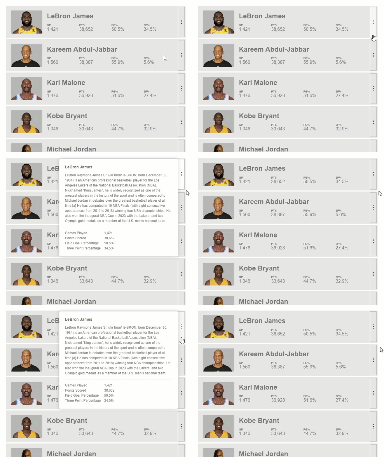
As of right now, we’ve done basically nothing to make it accessible. The first thing that we need to do is add the proper ARIA roles and attributes.
Adding the Proper ARIA Roles and Attributes to the Angular CDK Overlay
For those of you who are unfamiliar with ARIA, it stands for Accessible Rich Internet Applications. It’s a specification created to provide more semantic information to web applications where there otherwise wouldn’t be any. ARIA doesn’t provide any functionality or interactivity, just information for assistive technology to better understand the code and provide the user with useful information.
Since our pop-up is created with generic mark-up, there are essentially no semantics for it. A user using assistive technology wouldn’t really be able to understand much about what’s going on. Ok, let’s start adding what we need.
When we look at the pop-up, the guts of the overlay are contained in our player details component. So, this is where we will handle most of our accessibility. The first thing we need to add is the ARIA role, dialog. This role identifies the element as a dialog container.
player-details.component.html
<section role="dialog">
    ...
</section>
Next, we need to add the aria-modal attribute with a value of true. This attribute tells assistive technologies that the windows underneath are not available for interaction.
<section
    ...
    aria-modal="true">
    ...
</section>
Next, we need to add the aria-labelledby attribute. This attribute gives the dialog an accessible name by referring to the element that provides the dialog title. For this attribute we need to add an id to the title element in our overlay, our H3. Then we will pass this id to the aria-labelledby attribute.
<section
    ...
    aria-labelledby="dialog-title">
    <h3 id="dialog-title">...</h3>
    ...
</section>
The last ARIA attribute that we need to add is the aria-describedby attribute. This attribute gives the dialog an accessible description by referring to the dialog content that describes the primary message or purpose of the dialog. And just like aria-labelledby, we need to add an id to the region that describes the dialog, in this case it will be the paragraph for our player description. Then we will pass this id to the aria-describedby attribute.
<section
    ...
    aria-describedby="dialog-description">
    <p id="dialog-description">...</p>
    ...
</section>
Ok, so now our pop-up will make more sense to users accessing our app with assistive technologies.
Managing Focus for the Angular CDK Overlay With the cdkTrapFocus directive
Next up we need to make it function as expected based on the information that we’ve provided with ARIA. The main concern here is how we handle user focus when the pop-up is open. Right now, when we open our pop-up and then use the tab key to navigate around, we can see that items behind the pop-up receive focus. This shouldn’t happen.
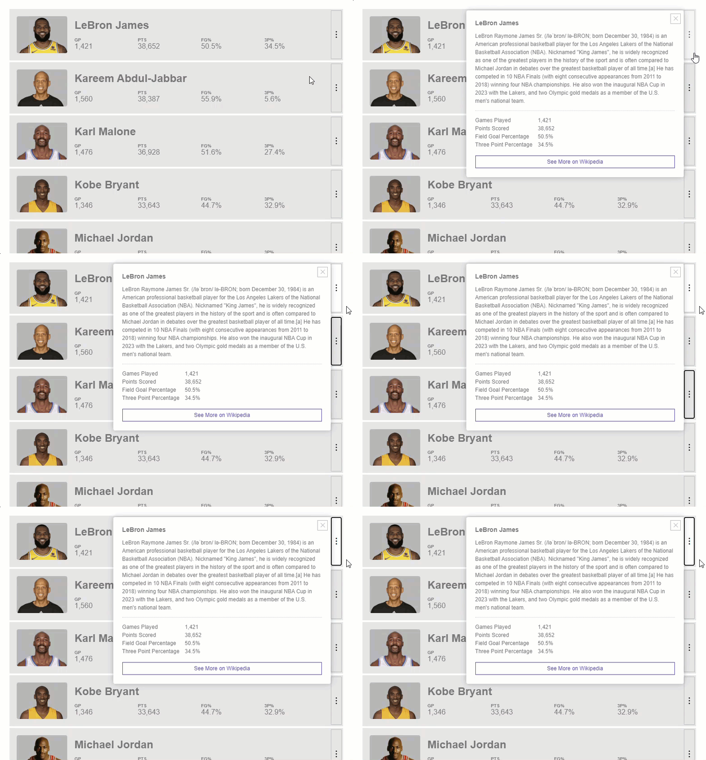
Instead, we need to programmatically set focus within the pop-up and then trap focus within while it’s open. Almost like a mini browser within the browser itself. Good news, this is pretty quick and easy for us to do thanks to another feature within the Angular CDK, the cdkTrapFocus directive.
When this directive is added to a container, it will trap the the focus within, meaning as the user tabs around they will stay on focusable items within the focus trap container. They will not be able to navigate outside of it. Ok, so let’s add it to our example.
First thing we need to do is import the A11y Module from the CDK in our player details component.
player-details.component.ts
import { A11yModule } from '@angular/cdk/a11y';

@Component({
  selector: 'app-player-details',
  imports [..., A11yModule]
})
And now, back in the template, we can add the cdkTrapFocus directive to the container element.
player-details.component.html
<section
    ...
    cdkTrapFocus>
    ...
</section>
At this point however, it wont really do anything. We first need to programmatically set focus within the region when the pop-up opens. And after that, we’ll be trapped within this region. Well, more good news, this is quick and easy too thanks to the CDK. The cdkTrapFocus directive has an @Input cdkTrapFocusAutoCapture, when we set this to true, it will now set focus on the first focusable item within the region. So, let’s give this a try now.
<section
    ...
    cdkTrapFocus
    cdkTrapFocusAutoCapture="true">
    ...
</section>
When we open the modal and tab around, we can see that we start focused on this button at the bottom and then only tab between that button and the close button at the top. So, we’re properly trapped now which is cool.
Handling Initial Focus With the cdkFocusInitial Attribute
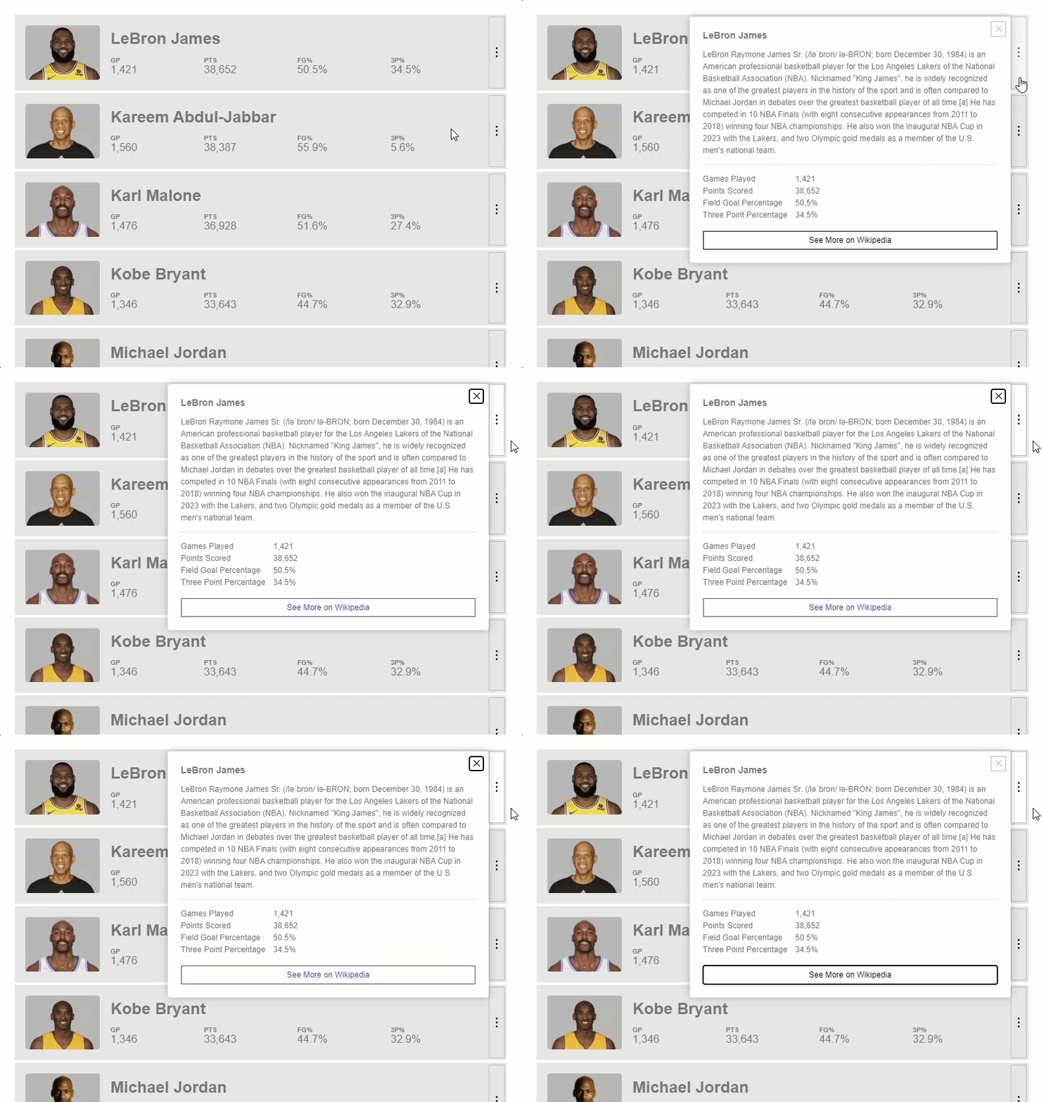
I don’t really like that we start out focused on the button on the bottom when the modal is opened though. I’d rather start out focused on an item that is invisible and that is not part of the tab order. This would make it feel better and probably be a little less confusing from an accessibility standpoint too.
Well, guess what, this too is easy thanks to the CDK. We just need to add a tabindex of negative one to something near the start of the focus trap region, let’s add it on our title H3 element. Then we can add a special attribute that lets the cdkTrapFocus directive know that this is the start of our trap region, the cdkFocusInitial attribute.
<section
    ...>
    <h3 id="dialog-title" tabindex="-1" cdkFocusInitial>...</h3>
    ...
</section>
And the reason that we use a tabindex value of negative one is because it can only receive programmatic focus this way. It won’t be part of the tab order. Ok, now let’s try this out.
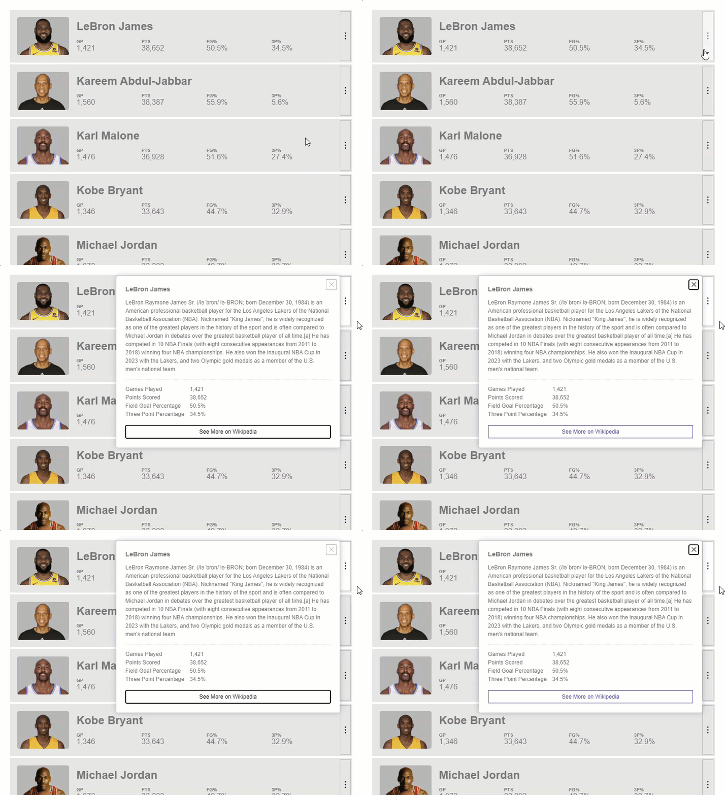
Finally we’re there. Nothing appears focused when we open. Then as we tab, the buttons get focused and we never navigate outside of the pop-up. And, if we hit shift tab, we navigate backwards.
Pretty cool.
Handling Keyboard Functionality for the Angular CDK Overlay
The last piece that we need to handle is the overall keyboard accessibility for the pop-up. Now, there’s not a whole lot to this since we are already managing focus. All we really need to do is make sure that we can navigate to the pop-up and that we can use the escape key to close it.
Currently, when we tab, we can focus the button for the pop-up so that’s good. If we hit enter to activate the button our pop-up properly opens, that too is good. And, when we hit the escape key it closes correctly too so that’s good. This behavior is built right into the cdkConnectedOverlay which is pretty nice.
But, in the last post on the overlay, we added some nice open and close transitions and currently, when we close with the escape key, it looks like our close transition is not properly running. This is because the overlay is detached before our animation can run. But this is pretty easy to fix.
What we can do is, over in the player component where our cdkConnectedOverlay directive is used, we can disable the default close functionality with the cdkConnectedOverlayDisableClose @Input.
player.component.html
<ng-template
    cdkConnectedOverlay
    ...
    [cdkConnectedOverlayDisableClose]="true">
    ...
</ng-template>
Now, we can wire up our own custom escape key event using the overlayKeydown output. This event will fire every time a key is pressed while the pop-up is opened and it will fire with the keyboard event of the key that was pressed. So, on the event we can access the key and check if it’s equal to “Escape”. If it is, we’ll trigger our details component to close just like we’re doing on the overlayOutsideClick event. Otherwise, we’ll do nothing.
<ng-template
    cdkConnectedOverlay
    ...
    (overlayKeydown)="$event.key === 'Escape' ? detailsComponent.close() : null">
    ...
</ng-template>
Now when we open the modal, and then when we hit the escape key to close, it properly closes and now it transitions out too.
So, in the end here, we should have a pretty accessible pop-up. It should work better and make more sense for everybody really.
Remember, accessibility is important!
I hope this was helpful for you and makes it easier for you to build accessible things in Angular.
Found This Helpful?
If you found this article helpful and want to show some love, you can always buy me a coffee!
Want to See It in Action?
Check out the demo code and examples of these techniques in the in the stackblitz example below. If you have any questions or thoughts, don’t hesitate to leave a comment.
