

Table of contents
- Angular CDK Overlay Tutorials:
- The Demo Application
- Using an Angular :enter and :leave Animation to Animate the CDK Overlay
- Using an Angular State-based Animation to Animate the CDK Overlay
- Creating a State-based Animation in the Component Animations Metadata
- Triggering the State-based Animation When Opening and Closing the CDK Overlay
- Using the Angular Animation Done Event and an EventEmitter to Close the CDK Overlay
- Making the Animation Better With the cdkConnectedOverlayTransformOriginOn @Input
- Found This Helpful?
- Want to See It in Action?
When using the Angular CDK Overlay module, you will likely want to transition the opening and closing of the overlay content. It’s something that seems like it should be pretty easy and straightforward but it’s actually a little tricky. It can’t really be transitioned with CSS only because it’s markup that gets added into and removed from the document. It’s not a simple style or class change. We need to leverage Angular animations to make it work well. In this post I’ll show you why and I’ll show you how to make animations work for your overlays. Alright, let’s get to it!
Ok, before we get too far along, I’ve created several posts on the Angular CDK Overlay module where I demonstrate how to setup overlays for some common scenarios, how they are positioned, and how they react when scrolling the containers they are contained within.
Angular CDK Overlay Tutorials:
So, if you’re new to these concepts, you’ll probably want to check them out first because everything we’ll see in this post will build off the concepts from those videos.
The Demo Application
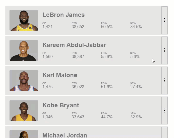
Ok, here we have the example that we’ve been working on throughout the videos on the Overlay module.
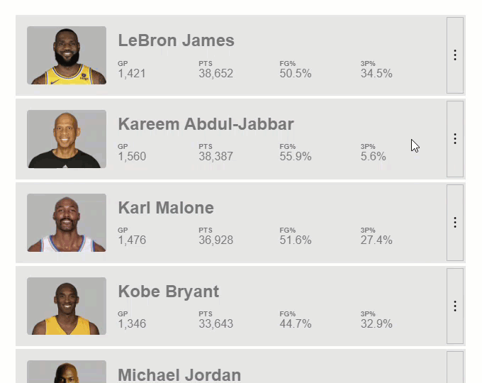
It’s a list of NBA players and when we click the button on the right, we get a pop-up that’s created with the Overlay module with more details about the player. It works well, but we want to ease in the pop-up when it opens and then we want to ease it out when it closes. This should be easy right?
Using an Angular :enter and :leave Animation to Animate the CDK Overlay
If you’ve used Angular animations in the past, you’d probably expect to use a simple :enter and :leave animation. This type of animation in Angular allows us to animate items that are physically entering into and out of the DOM. This is something that CSS currently does not support.
So, let’s try this and see what happens.
Creating an :enter/:leave Animation in the Component Animations Metadata
Let’s start by adding the animations array. Within this array, let’s add a trigger, we’ll call it “animation”.
player-details.component.ts
@Component({
    selector: 'app-player-details',
    ...
    animations: [
        trigger('animation', [
        ])
    ]
})
Then let’s add a transition for our :enter event. Well use the style() method to add the style we’ll start from. We’ll add a style object where we’ll start from an opacity of zero. And, we’ll start from a scale of point eight. Then, we’ll use the animate() method, for the timings we’ll use a duration of zero point one five seconds and we’ll use ease-in-out for our timing function. And we’ll animate to another style object. This time we’ll be transitioning to an opacity of one and a scale of one as well.
@Component({
    selector: 'app-player-details',
    ...
    animations: [
        transition(':enter', [
            style({
                opacity: 0,
                transform: 'scale(0.8)'
            }),
            animate('0.15s ease-in-out', style({
                opacity: 1,
                transform: 'scale(1)'
            }))
        ])
    ]
})
Now we’ll add another transition for our :leave state. This time we’ll start from our open state with a style object containing an opacity of one and a scale of one too. Then we’ll add another animation function. We’ll add the same timing, zero point one five seconds with an ease-in-out timing function. We’ll add another style object to animate to an opacity of zero and a scale of zero point eight, so the inverse of our enter animation.
@Component({
    selector: 'app-player-details',
    ...
    animations: [
        trigger('animation', [
            transition(':enter', [
                style({
                    opacity: 0,
                    transform: 'scale(0.8)'
                }),
                animate('0.15s ease-in-out', style({
                    opacity: 1,
                    transform: 'scale(1)'
                }))
            ]),
            transition(':leave', [
                style({
                    opacity: 1,
                    transform: 'scale(1)'
                }),
                animate('0.15s ease-in-out', style({
                    opacity: 0,
                    transform: 'scale(0.8)'
                }))
            ])
        ])
    ]
})
Binding the Animation to the Component Host With the @HostBinding Decorator
Ok, now we have the animation setup, but we need to bind it to our player details host element. So, we need to add the @HostBinding decorator. We’ll add our animation trigger, then we’ll create an “animationState” property and we’ll set it to true so that our animation will properly be bound on the host.
export class PlayerDetailsComponent {
    @HostBinding('@animation') animationState = true;
}
Ok, now let’s check this out and see what happens.
Nice, the animation on open looks great but when we close it looks like it didn’t animate. And, this is because a leave event didn’t fire for this inner component that we’re trying to animate. The overlay is destroyed and removed before the close animation can run. The overlay is detached before the animation completes.
We need to complete the close animation before the overlay is detached. So, we’re going to need to do this a different way.
Using an Angular State-based Animation to Animate the CDK Overlay
What we can do here is actually switch to a state-based animation. We’ll go with a concept of having a “hidden” state and a “visible” state for our overlay content.
Creating a State-based Animation in the Component Animations Metadata
Let’s remove the code for the :enter/:leave animation and then replace it with our hidden state. We’ll add a style object with opacity zero and scale of zero point eight.
@Component({
    selector: 'app-player-details',
    ...
    animations: [
        trigger('animation', [
            state('hidden', style({
                opacity: 0,
                transform: 'scale(0.8)'
            })
        ])
    ]
})
Then we’ll add another state call for our visible state. This state will have a style object with opacity of one and a scale of one as well.
@Component({
    selector: 'app-player-details',
    ...
    animations: [
        trigger('animation', [
            state('hidden', style({
                opacity: 0,
                transform: 'scale(0.8)'
            }),
            state('visible', style({
                opacity: 1,
                transform: 'scale(1)'
            }))
        ])
    ]
})
Alright, now we just need to add the transition between these states, so let’s add the transition function. And we’ll transition between hidden and visible states. We’ll also animate this transition with the animation function. Our animation will run over zero point one five seconds and will use an ease-in-out timing function.
@Component({
    selector: 'app-player-details',
    ...
    animations: [
        trigger('animation', [
            state('hidden', style({
                opacity: 0,
                transform: 'scale(0.8)'
            }),
            state('visible', style({
                opacity: 1,
                transform: 'scale(1)'
            })),
            transition('hidden <=> visible', animate('0.15s ease-in-out'))
        ])
    ]
})
Ok, now for this animation to work correctly, we’ll need to switch our animationState from a Boolean to a hidden/visible string instead, so we’ll initialize it to hidden.
export class PlayerDetailsComponent {
    @HostBinding('@animation') animationState = 'hidden';
}
Triggering the State-based Animation When Opening and Closing the CDK Overlay
Now, when the component is created, we’ll set this property to visible which will then trigger the open animation to run. We need to add the AfterViewInit lifecycle hook for this. And we’ll need to implement the interface too. Then, within the hook, we’ll set our animationState to visible.
export class PlayerDetailsComponent implements AfterViewInit {
    ...
    ngAfterViewInit() {
        this.animationState = 'visible';
    }
}
That will trigger the animation on open. Now, we need to handle the close. To do this, we need to do a few things.
First, let’s add a public close method. Inside of this method, let’s set our animationState to hidden.
export class PlayerDetailsComponent implements AfterViewInit {
    ...
    close() {
        this.animationState = 'hidden';
    }
}
Ok, now in our player component that opens this pop-up, we need to be able to access the instance of our player details component so that we can call the close method that we just added.
We’ll use the view child decorator to do this. Its selector will be the PlayerDetailsComponent, and we’ll name this property detailsComponent. It will be typed to the PlayerDetailsComponent as well.
player.component.ts
export class PlayerComponent {
    @ViewChild(PlayerDetailsComponent) detailsComponent!: PlayerDetailsComponent;
}
Ok, now in our component template, in the overlayOutsideClick event, we’ll now call our detailsComponent.close() method instead of setting our detailsOpen property to false.
player.component.html
<ng-template
    cdkConnectedOverlay
    ...
    (overlayOutsideClick)="detailsComponent.close()">
</ng-template>
So, this will trigger the close animation to run but it will not actually detach the overlay. In order to properly detach the overlay, we need to wait until the close animation completes and then notify the player component so that it can properly detach the overlay.
Using the Angular Animation Done Event and an EventEmitter to Close the CDK Overlay
So, back over in the player details component, we need to add an @Output that will emit when the animation completes. We can add the output decorator with a closed property. This property will be a void event emitter. We’ll fire it when the close animation completes.
player-details.component.ts
export class PlayerDetailsComponent implements AfterViewInit {
    ...
    @Output() closed = new EventEmitter<void>();
}
Now, we need a way to wire up to the close animation done event. To do this, we’ll use an animation done event callback. Since our animation is bound on the host of this component, we’ll need to use the @HostListener decorator to listen for the animation done event. And we’ll need to pass through the event. Then we’ll create a done method. And it will have an event parameter that will be typed to an AngularAnimation event. Within this method, we need to check if we are animating to the hidden state. Then within this check, we’ll emit our closed event.
export class PlayerDetailsComponent implements AfterViewInit {
    ...
    @HostListener('@animation.done', ['$event']) done(event: AnimationEvent) {
        if (event.toState === 'hidden') {
            this.closed.emit();
        }
    }
}
The last thing we need to do is detach the overlay when this event fires. So, let’s go back to the player component template. On our player details component, let’s add our closed event. When it fires, we’ll set the detailsOpen property to false.
<ng-template
    cdkConnectedOverlay
    ...>
    <app-player-details [player]="player" (closed)="detailsOpen = false"></app-player-details>
</ng-template>
Ok, now it will still transition as it opens and it will now transition when when it closes too.
Cool, so now we have a working open and close animation for our pop-ups but we can make it even better.
Making the Animation Better With the cdkConnectedOverlayTransformOriginOn @Input
The cdkConnectedOverlay directive provides the ability for us to specify the item to place a transform-origin on in order to better animate the overlay from the origin element. To do this we can add the cdkConnectedOverlayTransformOriginOn@Input and in this case we are animating the app-player-details element so we’ll set that as the selector for this input.
<ng-template
    cdkConnectedOverlay
    ...
    cdkConnectedOverlayTransformOriginOn="app-player-details">
</ng-template>
Nice, now our pop-up will animate from and to the attachment point on the origin.
Ok, so now you know how to animate the opening and closing of overlays. I hope this helps you as you build out modals, pop-ups, tool tips and similar items in your angular apps. Keep an eye out for more videos on the Overlay module in the future.
Found This Helpful?
If you found this article helpful and want to show some love, you can always buy me a coffee!
Want to See It in Action?
Check out the demo code and examples of these techniques in the in the stackblitz example below. If you have any questions or thoughts, don’t hesitate to leave a comment.