

Most of the time, when creating responsive applications in Angular, we just need to use CSS and media queries. Every once in a while though, we need to alter some interactivity or logic based on these same media queries. Meaning, we need to access them in some way from JavaScript. And this can get a little messy sometimes. Luckily for us, we can use the Breakpoint Observer utility provided by the Angular CDK. Let’s check it out!
To start off, we really should avoid doing this type of thing if possible. If we can simply change some style with a media query in CSS, that’s going to provide the best experience. This technique should really only be used when style isn’t the only thing that needs to be changed. Like, when logic or functionality is involved.
What is the Angular CDK Breakpoint Observer?
Ok, so what is the Breakpoint Observer? Well, it’s a utility that is part of the Angular CDK or Component Development Kit. And, you can probably guess by its name, but it allows us to monitor media queries programmatically and then react to them as needed. It’s probably easiest to understand through an example, so, let’s look at one.
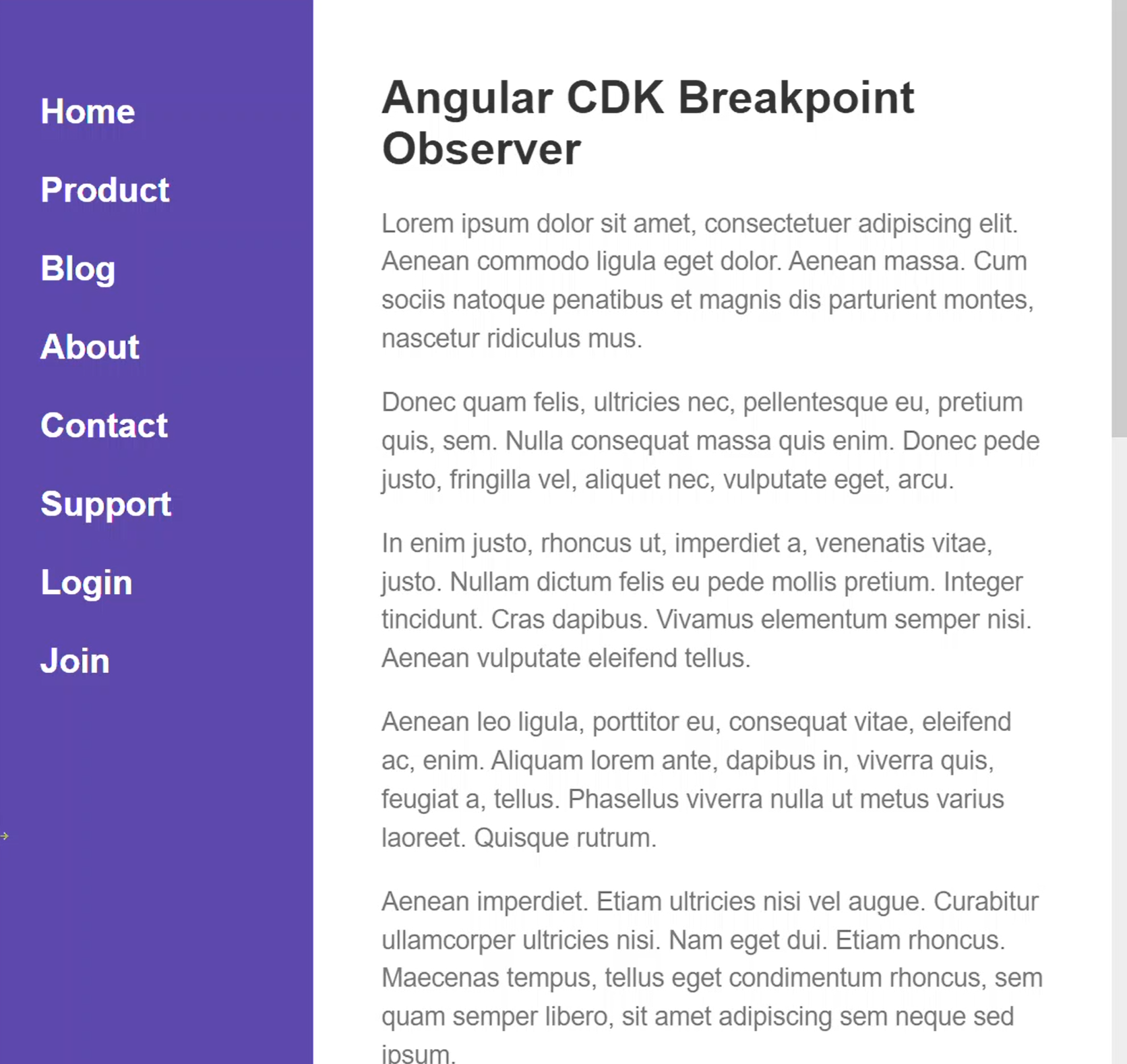
Ok, here we have this layout with our navigation next to our main content.
And, when we resize this smaller, the menu is hidden.
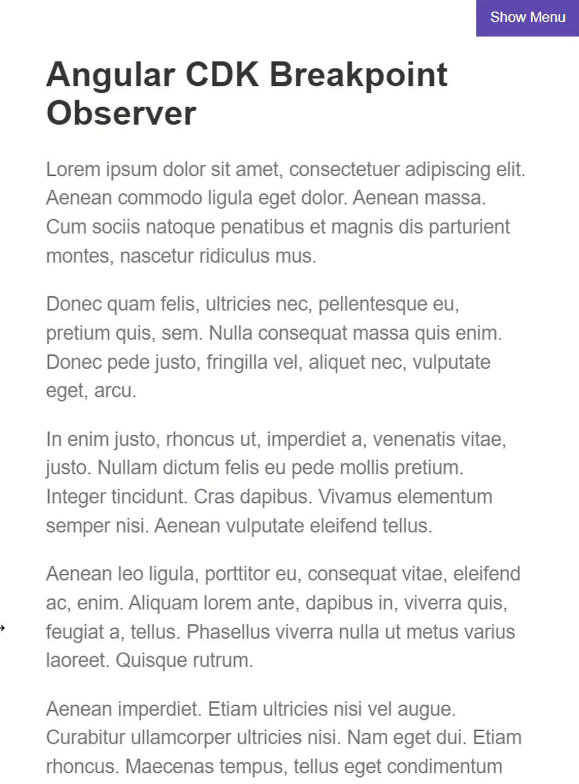
We can toggle the sidebar display by clicking the "Show Menu" button in the upper right corner.
So far, so good.
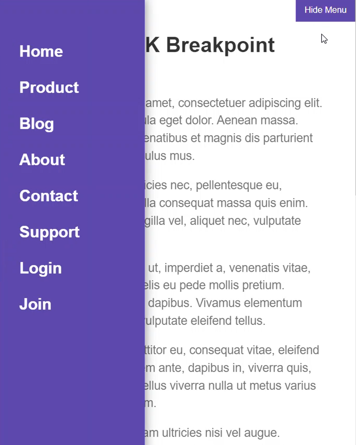
But where the problem comes in, is when we toggle the menu open, then resize larger, and then resize smaller again, the menu is still open. We don’t want this. What we really want to do here is remove the class that makes this visible as soon as we resize to where the menu is always visible. That way, when we shrink back down, it will start off hidden again.
So in our code, we are simply toggling the isVisible property when we click the button.
nav.component.html
<button (click)="isVisible = !isVisible">
  {% raw %}{{ isVisible ? 'Hide Menu' : 'Show Menu' }}{% endraw %}
</button>
Then, we bind this visible class on our nav element when true.
<nav [class.visible]="isVisible">
  ...
</nav>
That class is what positions the menu and makes it visible. So, we’re going to want to set this property to false at the breakpoint where the menu becomes always visible again.
Alright, to begin using the Breakpoint Observer, you need to have the Angular CDK installed. To do this, you just need to use your command line from within your angular app, and run the following command:
npm i @angular/cdk
That will properly install the CDK and all of its dependencies so that we can use them. Now, in this demo project, I’ve already installed it so we’re ready to use it.
We start by injecting it within our constructor.
nav.component.ts
import { BreakpointObserver } from '@angular/cdk/layout';

@Component({
  selector: 'app-nav',
  standalone: true,
  imports: [CommonModule],
  templateUrl: './nav.component.html',
  styleUrls: ['./nav.component.scss']
})
export class NavComponent {
    constructor(private breakpointObserver: BreakpointObserver) {}
}
Now, what we want to do is react when our browser is resized and the breakpoint that hides our menu no longer matches. This style change occurs at a max-width of 585px.
Now, in our ngOnInit method, we’ll access our breakpoint observer. We'll use its use the observe method. This method takes either a single media query as a string, or an array of media query strings. In our case, we have a single media query, a max-width of 585px, so we’ll add it.
This method returns an observable that will fire with a value of a BreakpointState object which contains a matches Boolean value. This value will be true when we are matching our breakpoint, so when we are narrower than 585px. And, since it’s an observable we’ll need to subscribe. But, before we do, we need to make sure to properly remove the subscription on destroy. So we add our pipe, then our takeUntilDestroyed, and then we pass it our DestroyRef. Then we’ll name the state object returned, state.
When this state does not match, we’ll want to set our isVisible property to false. The observe method fires with a value every time the viewport is resized and it will simply set this property to true when it matches and false when it doesn’t.
@Component({
  selector: 'app-nav',
  standalone: true,
  imports: [CommonModule],
  templateUrl: './nav.component.html',
  styleUrls: ['./nav.component.scss']
})
export class NavComponent {
    protected isVisible = false;

    constructor(private breakpointObserver: BreakpointObserver,
                private destroyRef: DestroyRef) {}

    ngOnInit() {
      this.breakpointObserver.observe(`(max-width: 585px)`)
        .pipe(takeUntilDestroyed(this.destroyRef))
        .subscribe(state => {
          if (!state.matches) {
            this.isVisible = false;
          }
        });
    }
}
Now, when we resize down, the menu is hidden. Then, when we open it, and resize wider, and then back down, we see that the menu is no longer open. Just like we wanted.
Now, one thing I don’t like about our current set up is that we have our media query breakpoint in two locations. Once in our CSS, and then again in our breakpoint observer observe method. This could be pretty error prone. If we were to change the breakpoint where our menu becomes hidden and forget to update in the breakpoint observer, things would not work as expected. So, what I like to do is share this media query between the CSS and JavaScript maintaining it in a single location.
To do this we can move the breakpoint to a sass variable that we can use in our media query.
nav.component.scss
$menuHidden: 585px;
Then, on the host, I add a custom property with this same variable. For this, we need to use sass string interpolation for the variable because, if we don’t, the variable name with dollar sign and everything will be the rendered value for this custom property. We obviously don’t want that. What we do want is the actual value, so we use the hash and curly braces to get the string interpolated value of the variable.
:host {
  --breakpointForMenu: #{$menuHidden};
}
An important note here, unfortunately we can’t use custom properties in media queries, they just don’t work that way. Which is why I’m creating a sass variable and then using it in these two locations. This keeps it in a single location form maintainability while allowing to do what I need to do with both CSS and the breakpoint observer.
@media (max-width: $menuHidden) {
  ...
}
Ok, so now that we have this custom property on our host we can access its value from typescript instead of using the hard coded value from before. To do this, we need to inject in ElementRef within our constructor. Then we can create a breakpoint variable. We’ll set it to the computed style of our ElementRef’s native element. Then, we’ll get the value of the custom property that we just added. Now, we can switch our code to use this breakpoint value instead.
@Component({
  selector: 'app-nav',
  standalone: true,
  imports: [CommonModule],
  templateUrl: './nav.component.html',
  styleUrls: ['./nav.component.scss']
})
export class NavComponent {
    protected isVisible = false;

    constructor(private breakpointObserver: BreakpointObserver,
                private destroyRef: DestroyRef,
                private elementRef: ElementRef) {}

    ngOnInit() {
      const breakpoint = getComputedStyle(this.elementRef.nativeElement).getPropertyValue('--breakpointForMenu');
      this.breakpointObserver.observe(`(max-width: ${breakpoint})`)
        .pipe(takeUntilDestroyed(this.destroyRef))
        .subscribe(state => {
          if (!state.matches) {
            this.isVisible = false;
          }
        });
    }
}
There, it should still all work as expected. This allows us to keep both the styles and functionality here in sync, and should prevent some mistakes in the future.
CDK Predefined Breakpoints
Something else that’s pretty cool about this layout module from the CDK is that they provide some standard breakpoints based on Google’s Material Design concepts that we can just use if we want.
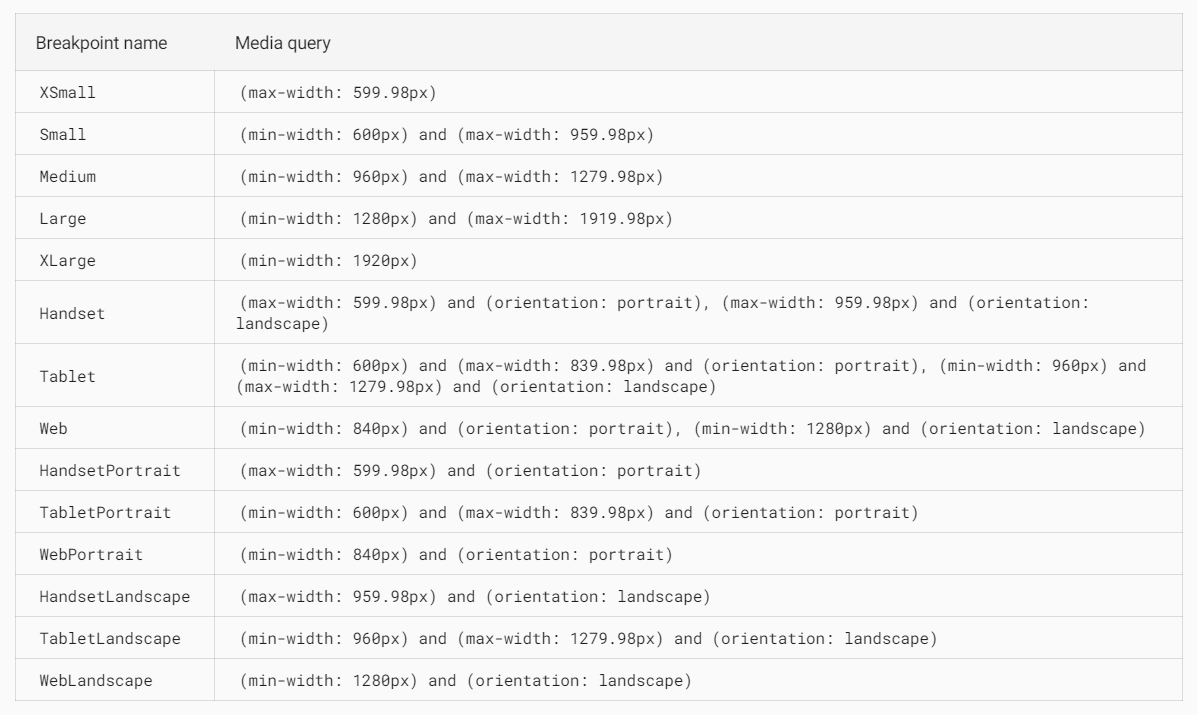
Here’s a list of the breakpoints and their values:
So, there’s quite a few to choose from out of the box, but how do you use them? Well, let’s look at an example.
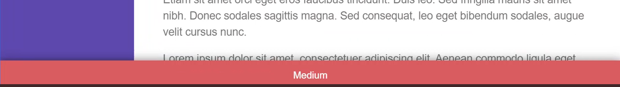
I’ve added this variable for our current visible breakpoint range, and it will be either small, medium or large.
@Component({
  selector: 'app-nav',
  standalone: true,
  imports: [CommonModule],
  templateUrl: './nav.component.html',
  styleUrls: ['./nav.component.scss']
})
export class NavComponent {
  ...
  protected currentRange?: 'Small' | 'Medium' | 'Large';
  ...
}
This value is going to be rendered in a red bar at the bottom of our view once we set it properly. Now, let’s add an additional observe. This time, let’s use an array of breakpoints. We’ll need to import Breakpoints from the CDK layout module and then we'll pass the small breakpoint, medium, and large.
Just like the previous example, we need to make sure to take until destroyed. Then we can subscribe. This time however, I’m not concerned with the state and you’ll see why in just a sec. Here we’re going to use another feature of the Breakpoint observer. We are going to check if our breakpoints are matched using the isMatched method. This returns a Boolean value based on the media query passed to it. From here we'll set the current range based on the matched media query.
import { BreakpointObserver, Breakpoints } from '@angular/cdk/layout';

@Component({
  selector: 'app-nav',
  standalone: true,
  imports: [CommonModule],
  templateUrl: './nav.component.html',
  styleUrls: ['./nav.component.scss']
})
export class NavComponent {
    ...
    protected currentRange?: 'Small' | 'Medium' | 'Large';

    ...

    ngOnInit() {
      ...

      this.breakpointObserver.observe([Breakpoints.Small, Breakpoints.Medium, Breakpoints.Large])
      .pipe(takeUntilDestroyed(this.destroyRef))
      .subscribe(() => {
        if (this.breakpointObserver.isMatched(Breakpoints.Small)) {
          this.currentRange = 'Small';
        }
        if (this.breakpointObserver.isMatched(Breakpoints.Medium)) {
          this.currentRange = 'Medium';
        }
        if (this.breakpointObserver.isMatched(Breakpoints.Large)) {
          this.currentRange = 'Large';
        }
      });
    }
}
Now we see our red bar at the bottom with the currently matched range.
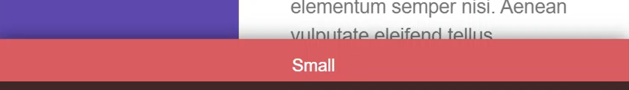
And, when we resize, it gets updated properly based on the media query that matches.
Pretty cool.
Ok, so I hope that helps for those of you out there who have a need for this type of thing in Angular. It’s definitely come in handy for me in the past. Be sure to keep an eye out for more videos in the future showcasing some of the power of the CDK.
Found This Helpful?
If you found this article helpful and want to show some love, you can always buy me a coffee!
Want to See It in Action?
Check out the demo code and examples of these techniques in the in the stackblitz example below. If you have any questions or thoughts, don’t hesitate to leave a comment.