HTML: How to Resize Markup Like an Image With CSS Container Queries!

You know what’s cooler than using an image when building a website? How about making something with HTML and CSS that looks and acts like an image? And you know what, this is super easy now with container queries. In this post we’re going to make an ad, that looks like an image, with HTML and CSS. Then we’re going to make it act like an image as it gets squished, expanded, and moved to other locations within the document. Ok, let’s check it out!
Ok, so we have this vans ad in the sidebar of the site that we are building and it’s currently an image.
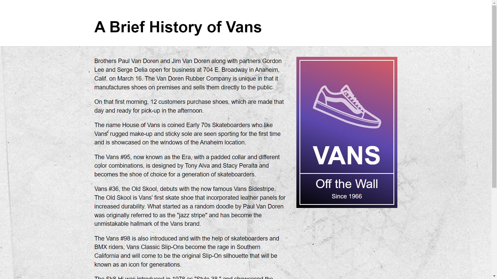
This makes it difficult to edit, a designer would need to update it and provide us with a new image if something needed to change.
Also, we’d probably need multiple versions to use with source set so that it will look crisp on both high density and low res displays.
So, we’re tasked with converting it to HTML, how can we do this?
Some Downsides to Using Images and Viewport Units
Well, we could probably use viewport units, but we’d need to add extra code if we were to put the ad in different locations where its dimensions would be different since everything would be based off the viewport and not the container dimensions.
So, we could pull it off, but it could get a little messy.
Instead, we could use container queries and container query units.
Container queries are a little like media queries but based off the dimensions of any given container in the page instead of the overall viewport.
Setting up a Container With the CSS container-type Property
Ok, let’s check out what we’re starting with.
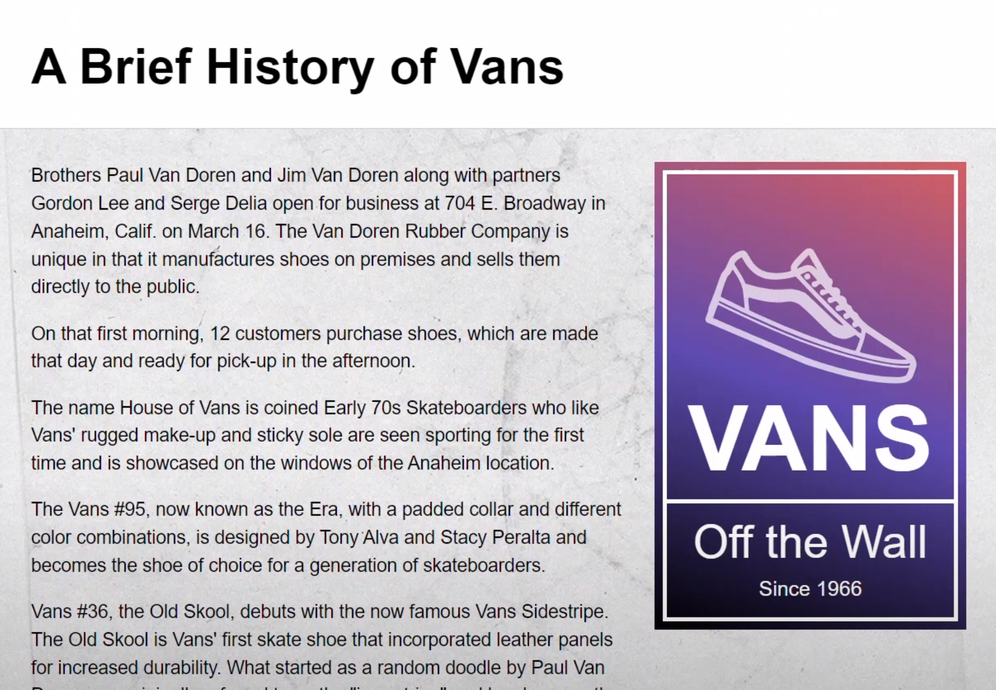
So, it looks pretty good right here but how does it do as it responds?
Uh, the text and borders don’t change size, so it needs some love cause it’s pretty broken as it stands.
Now one thing we’re already doing here is, we’re using an aspect-ratio which allows the container to respond as an image would so, that’s all good.
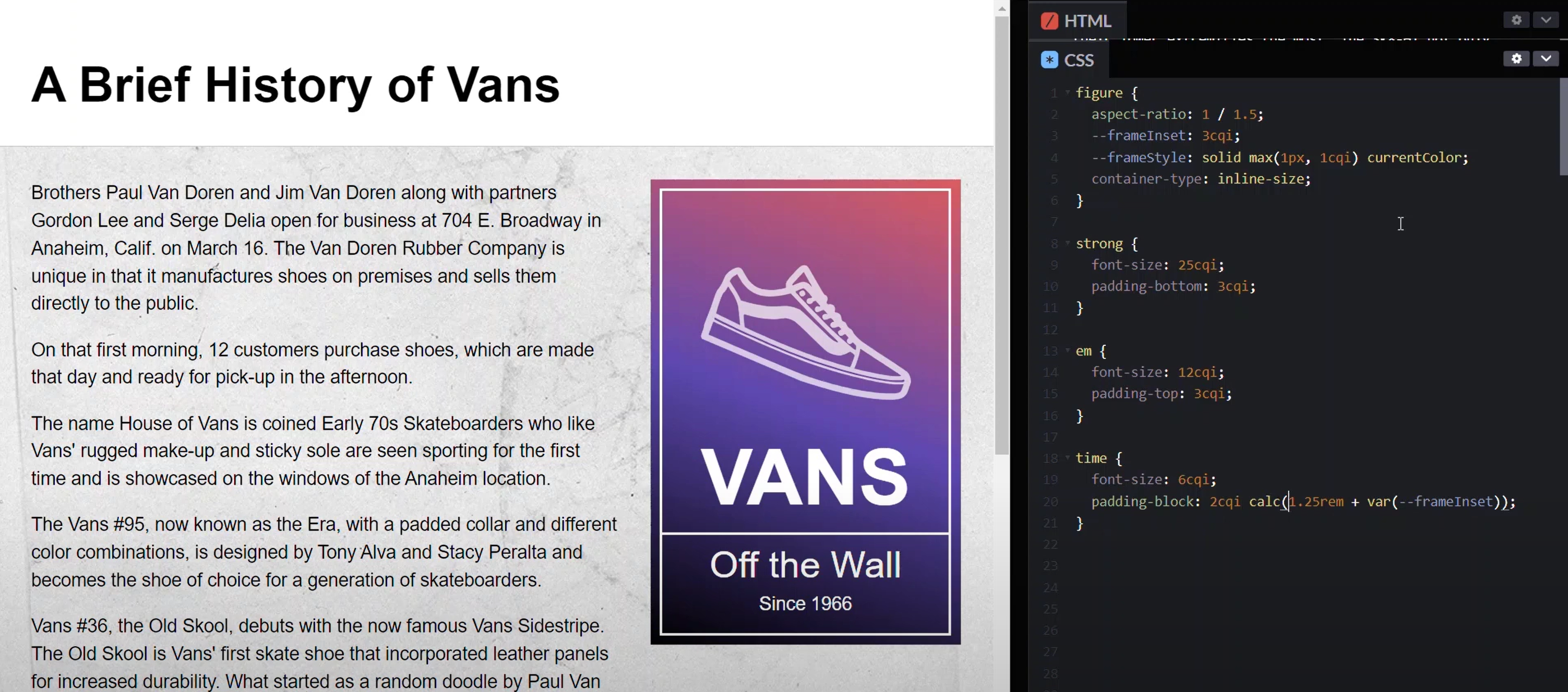
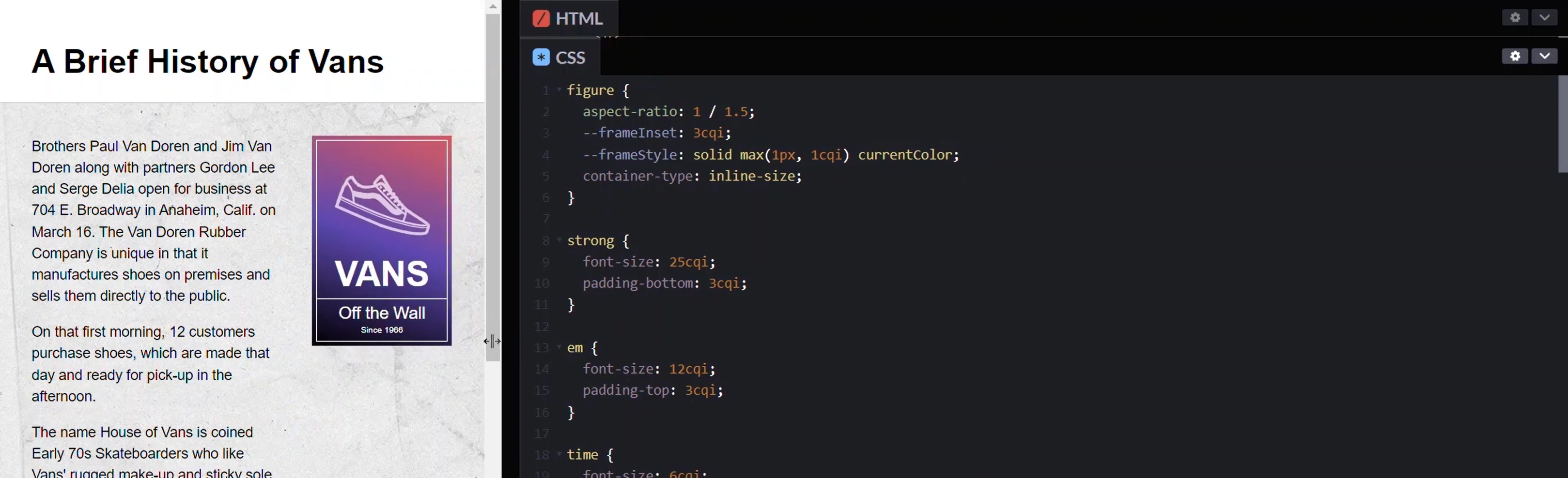
figure {
    aspect-ratio: 1 / 1.5;
}
We just need to change all the dimensions for the content to make it respond correctly too. The first step here is to provide a container to monitor our dimensions. This will be our figure element.
To use container queries here, we need to define what is known as a containment context. We can do this with the container-type property. For this example, we can use a value of inline size.
figure {
    ...
    container-type: inline-size;
}
This is going to set up a container that will size things based off its inline size which, in this case, will be the width of the figure.
Alright, so now we have a container to monitor, so we’re now free to use container query units.
And, there’s lot’s to choose from. We can use any of these unit values:
cqwcqhcqicqbcqmincqmax
Here we’re going to use cqi which, I believe, stands for container query inline. One cqi unit is equal to one percent of the width of the container. Ok, that’s all we need, from here we’re just setting units as needed.
Here we have a couple of custom properties that are used on several elements within this ad.
figure {
    ...
    --frameInset: 0.5rem;
    --frameStyle: solid 0.25rem currentColor;
}
Let’s start with the amount this frame is inset from the outer edge of the container. Let’s make it three cqi.
figure {
    ...
    --frameInset: 3cqi;
}
Next, let’s set the thickness of the borders here. In this case, I’m going to use the max function to prevent the borders from ever shrinking under one pixel, but I want them to be dynamic as long as they are larger than that one pixel value. So, the first value is one pixel, then the second is the dynamic value. Let’s make it one cqi.
figure {
    ...
    --frameStyle: solid max(1px, 1cqi) currentColor;
}
Now, for the strong element, which is the main title, the "Vans" text, let’s make it twenty-five cqi. And, for the space underneath the title, let’s make it three cqi.
strong {
    font-size: 25cqi;
    padding-bottom: 3cqi;
}
Now let’s move to the "Off the Wall" subtitle. It should be about half the size of the main title so let’s try twelve cqi. And, for the space above the text, let’s go with three cqi again.
em {
    font-size: 12cqi;
    padding-top: 3cqi;
}
Alright, for the last piece, the "Since 1966" label, let’s go with a font size of six cqi. And, for the space above and below, we’re using the logical property for padding-block which takes up to two values. The first value is the value above the text and the second value is for the space below. So, let’s go with two cqi above. And, in our calculation, we’ll leave the --frameInset as is, but we’ll go with five cqi of additional space.
time {
    font-size: 6cqi;
    padding-block: 2cqi calc(5cqi + var(--frameInset));
}
Ok cool, this looks good.
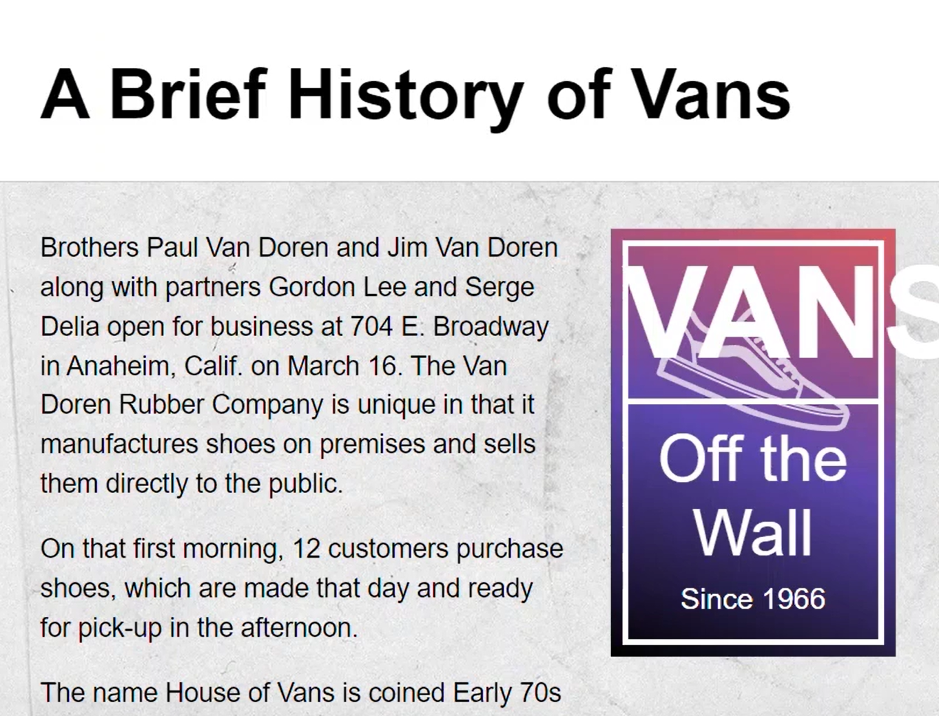
Let’s take a look at how it responds. As we squeeze it everything is properly responding uniformly like we wanted. It looks a lot like an image.
It looks pretty good even when it’s small and you can see that the borders never shrink below one pixel.
Then, when we get into really narrow widths it gets wider and everything still looks great.
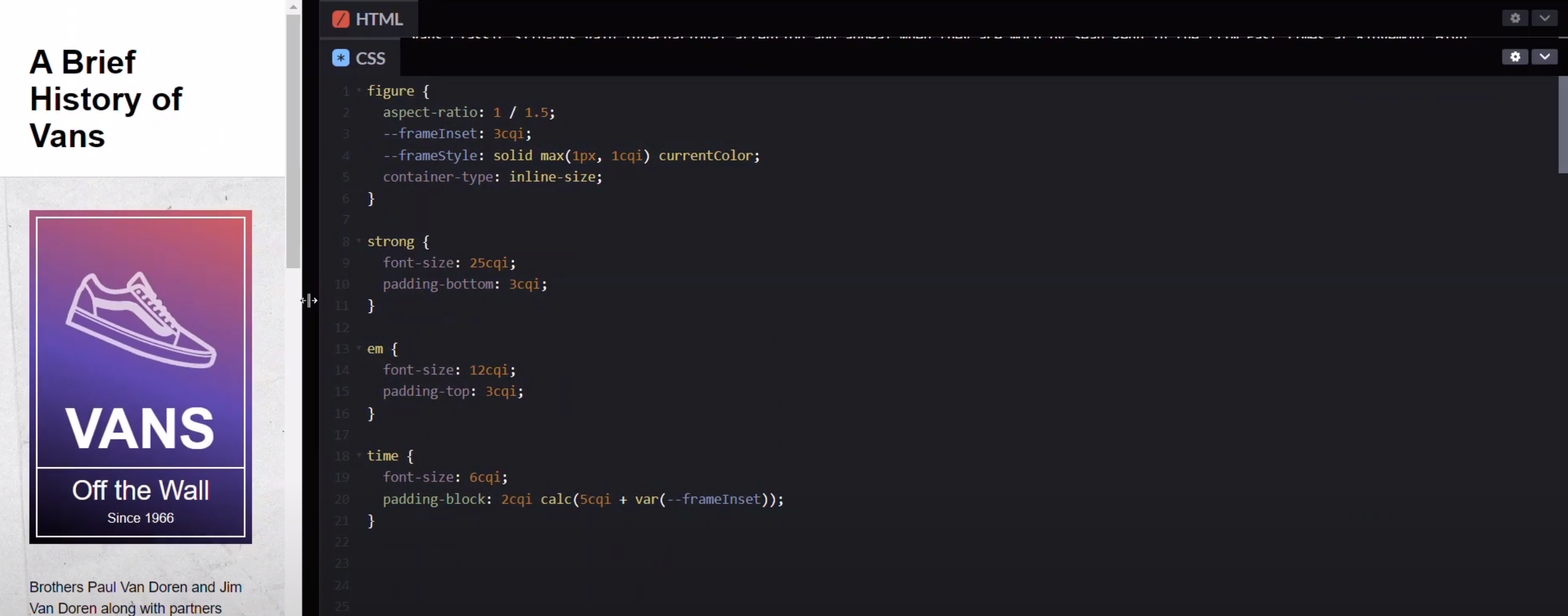
How cool is this? One set of styles and it just works all the way through. As we scale it back and forth it looks great.
Now, what’s even more cool is that we can take our ad mark-up, move it to or main column region here, and everything continues to work just like it would if it were an image.
<header><h1>A Brief History of Vans</h1></header>
<div class="content">
    <main>
        <figure>
            <svg viewBox="0 0 256 256">
                <path d="M90.4,67.9C88,69,87.1,70.6,83,80c-4.4,10.2-4.8,12.3-3.1,15"/>
                <path d="M97.4,95.2c-0.6,0.6-1.2,1.7-1.2,2.3s0"/>
            </svg>
            <figcaption>
                <strong>Vans</strong>
                <em>Off the Wall</em>
                <time>Since 1966</time>
            </figcaption>
        </figure>
        ...
    </main>
</div>
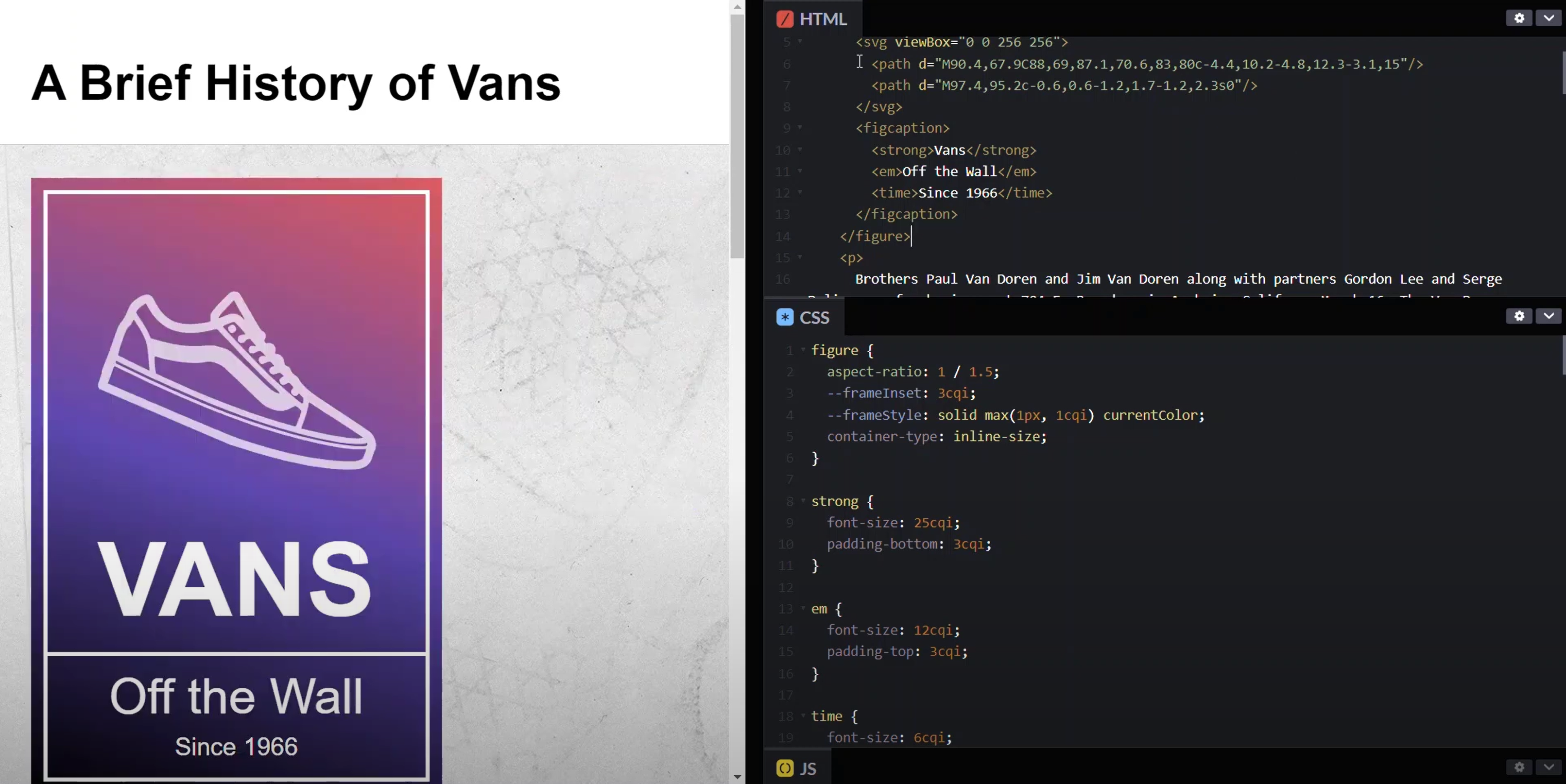
This is just so nice and so cool. Remember, there’s only one set of styles to pull all of this off. And, zero media queries involved.
There’s quite a bit more to container queries as a whole so be on the lookout for future posts where I cover different aspects.
Found This Helpful?
If you found this article helpful and want to show some love, you can always buy me a coffee!
Want to See It in Action?
Check out the demo code and examples of these techniques in the in the Codepen example below. If you have any questions or thoughts, don’t hesitate to leave a comment.


